Heatmapping the Japanese Earthquake Reports

Erik Hersman
Mar 17, 2011
Mar 17, 2011
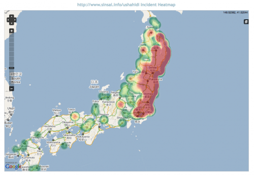
We're trying to come up with other ways of visualizing Ushahidi data. Using the Ushahidi API, Emmanuel whipped up a heatmap of the Japan deployment (http://sinsai.info/ushahidi). You can see it live here: http://demo.ushahidi.com/japan. On the live map, you can toggle the clustered numbers on/off using the "stack" button on the right side of the map.
We're thinking of doing two things to make this more useful:
Making it filterable by category.
Creating it as a plugin so that anyone can put it on their own Ushahidi deployment.
We'd like to hear from you. Is this valuable or useful? What other visualizations do you think would make sense to do?